Heuristic Evaluation
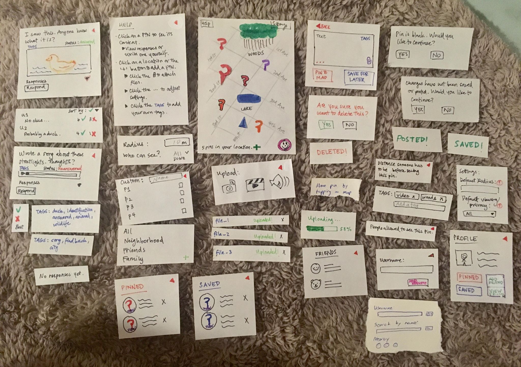
Here is an overview of all the parts of our paper prototype. It is meant to be a mobile phone design.
 Link
Link
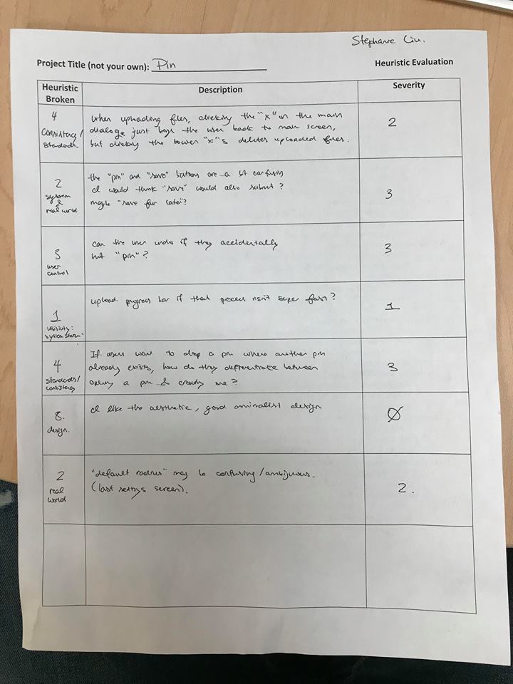
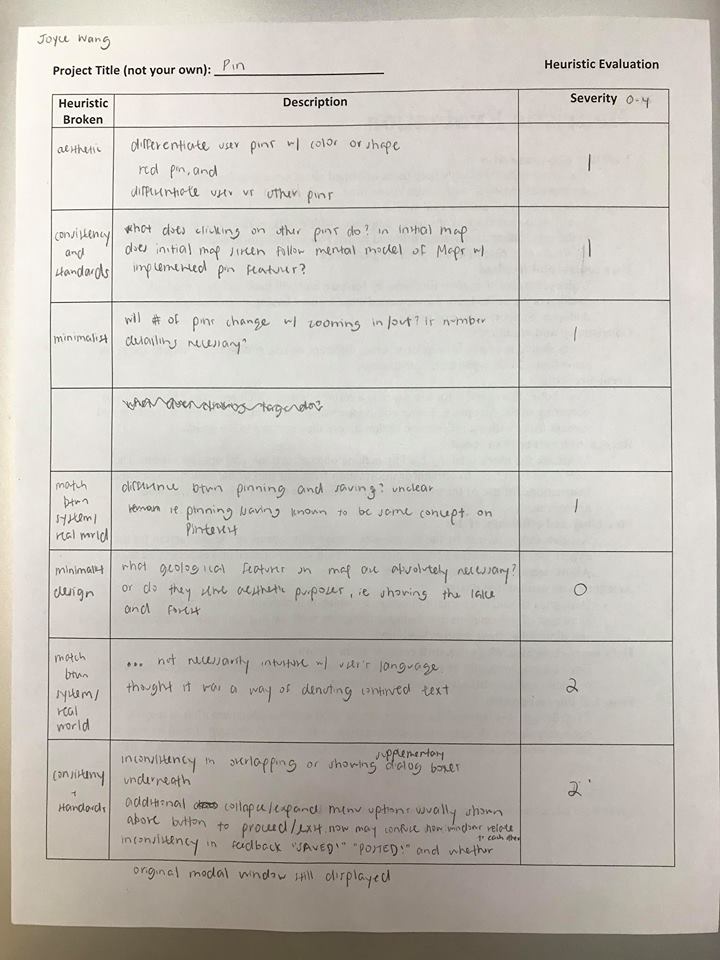
Karl faciliated Stephanie and Joyce’s heuristic evaluation of our paper prototype. Here are the evaluations and links to larger images:
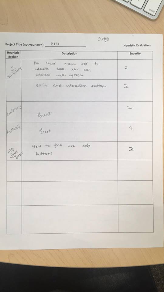
Alyssa and Lester facilitated Cliff’s heuristic evaluation of our paper prototype. Here is the evaluation and link to a larger image:
Notes
One major lesson was that we had no help system, and the user had nothing to check when they weren’t sure what exactly they were supposed to do. We also learned that our labels (color of pin, icon of button, label of button, etc) weren’t as unituitive as we imagined, and that we needed to be more explicit and consistent with how we choose the labels. We also needed to give more feedback to the user on what their current state is. Additionally, we assumed our app’s map interface/metaphor would give more information about its functionality than it actually did.