Usablitiy Test Check-In
Identified Issues
Match User’s Language: Severity (2)
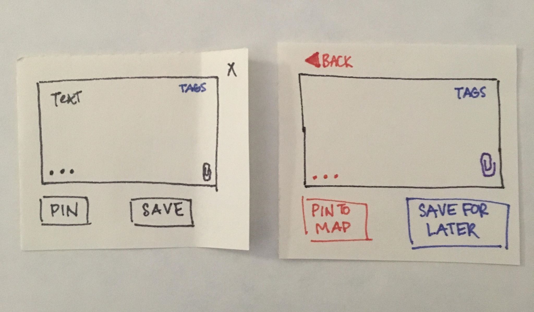
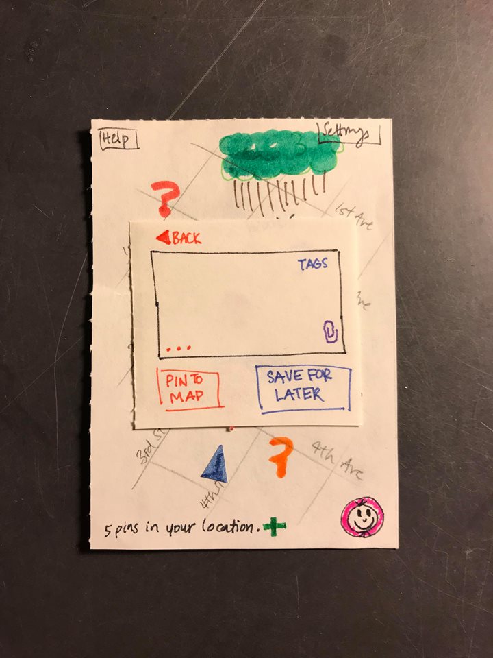
We realized that our labels for buttons were not as clearly marked and intuitive as we assumed they were. We have thus changed the text and the color of many of our buttons. For example, instead of using an “X” to return to the map, we use a red button labeled “BACK”.
Visibility: Severity (2)
The system status was sometimes unclear, and the users weren’t given enough feedback on what was happening. We have added progress bars and confirmation screens so that the user is more sure of what happens when they click on something.

Error Prevention and Diagnosis: Severity (3)
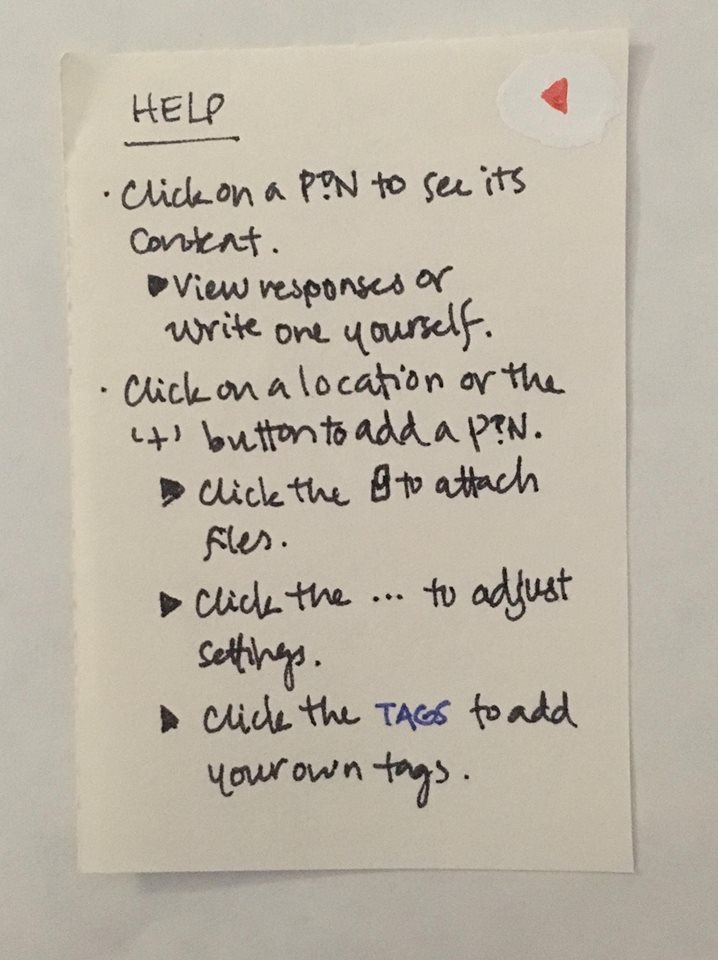
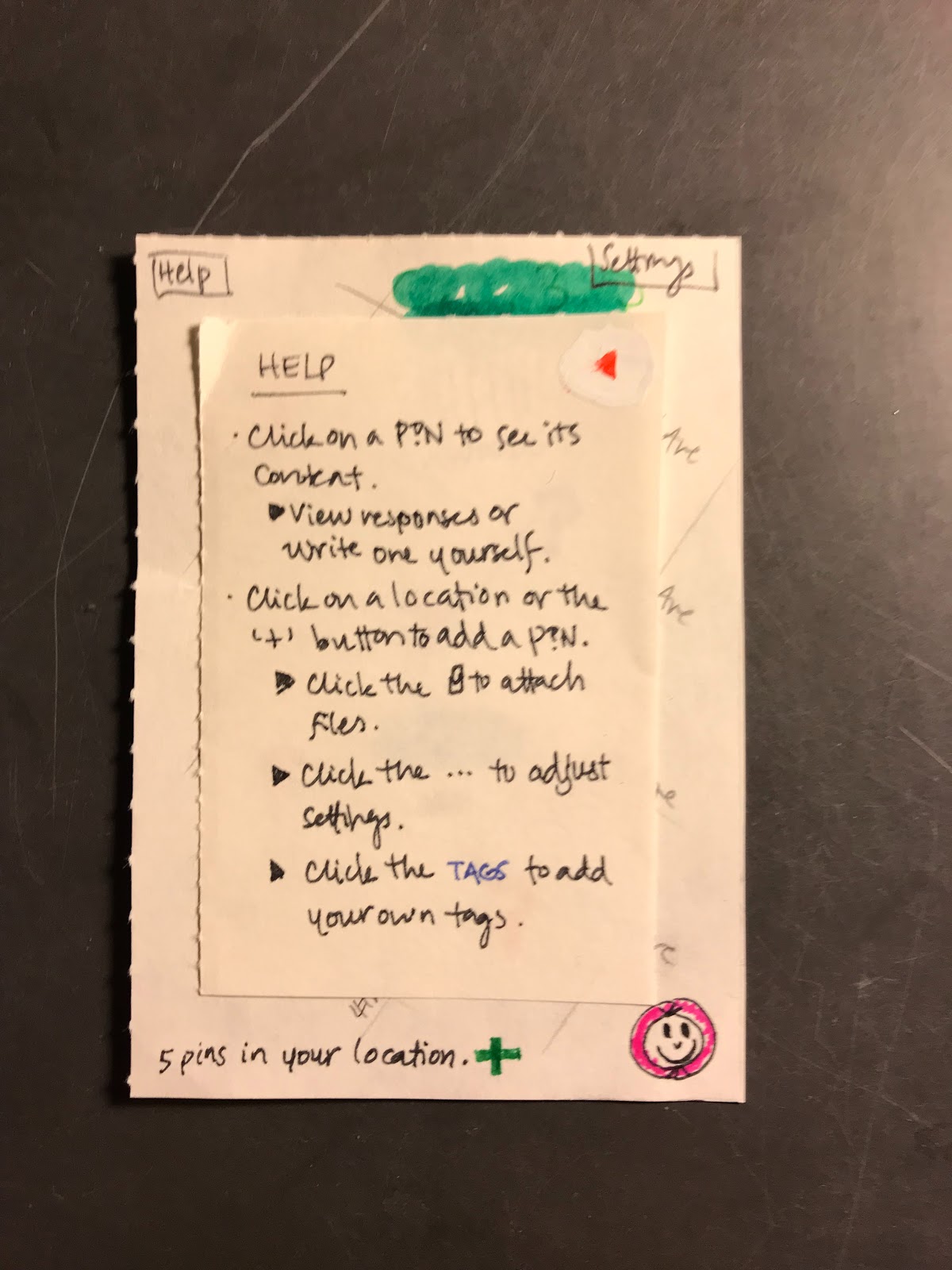
We did not include any help system previously, and users were left confused on exactly what they should be doing or how to do certain things. We have added a general help screen as well as hints and tips for various settings.
Usability Test Discussion
The first usability test was performed with our paper prototype on 4/11. The participant was a Williams student with no prior experience in usability testing or interface design. The test was performed in a room in Paresky Center with no outside distractions.
The participant and location were chosen for a few reasons. Firstly, by using a person with only limited experience with interface design and usability testing, we were hoping to observe how actual users would react during their first interaction with our product. Furthermore, by performing the test in a quiet room with few distractions we were hoping to prevent the user from being distracted by things going around them and therefore focus entirely on the product in front of them. While such an environment is unrealistic in practice, we wanted to see how well our current prototype would perform in an ideal setting.
The test was quite open in its structure. The user was given a brief description of what the product can accomplish, and then told to ask a question and answer a question. Keeping the test relatively free of structure was another step in trying to ensure that the users interactions mimicked those of a user trying our product for the first time. Karl was the person administering the test and his role was therefore to both observe and facilitate the user’s process in going through the tasks.
We learned several things about the testing process. The importance of describing in detail what the app’s purpose became apparent. If the person administering the test were to only describe the tasks that need to be performed or the purpose of the application then the ability of the user to figure out how to use the app would be diminished. Understanding the mindset of the application creator can be very beneficial when the user is trying to figure out exactly how to use a product. This description must be brief, since it would appear as a short blurb or description of the app in practice. We will make sure to provide better background information in our future usability tests.
Results
Incident 1, Severity 1
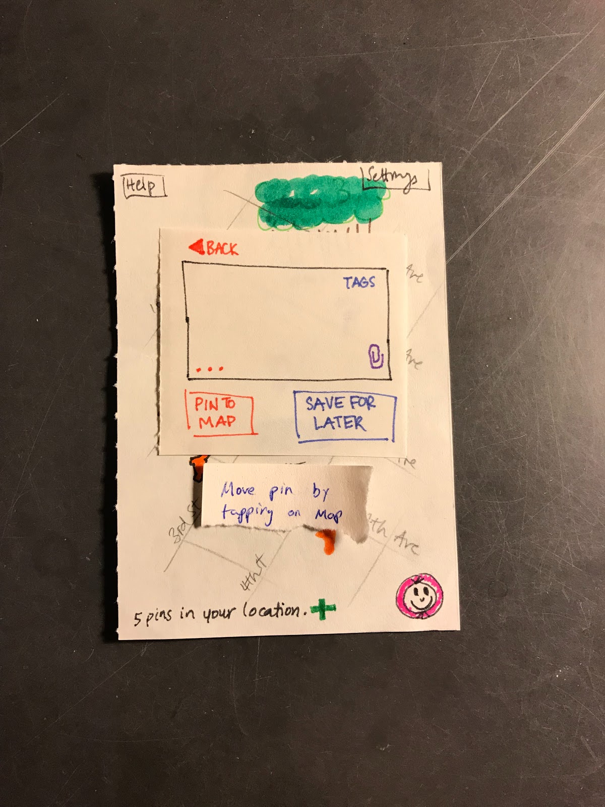
When the user was on the posting page they did not realize that they could move the pin that they had placed simply by clicking outside of the pin entry window. This is an issue as we had decided that we would allow users to move their placed pin by tapping outside of this window and then dragging the pin on the map. This issue has been resolved by adding a small pop up that appears outside the main text entry window alerting the user to the fact that they can move the pin if they so wish.
Incident 2, Severity 2
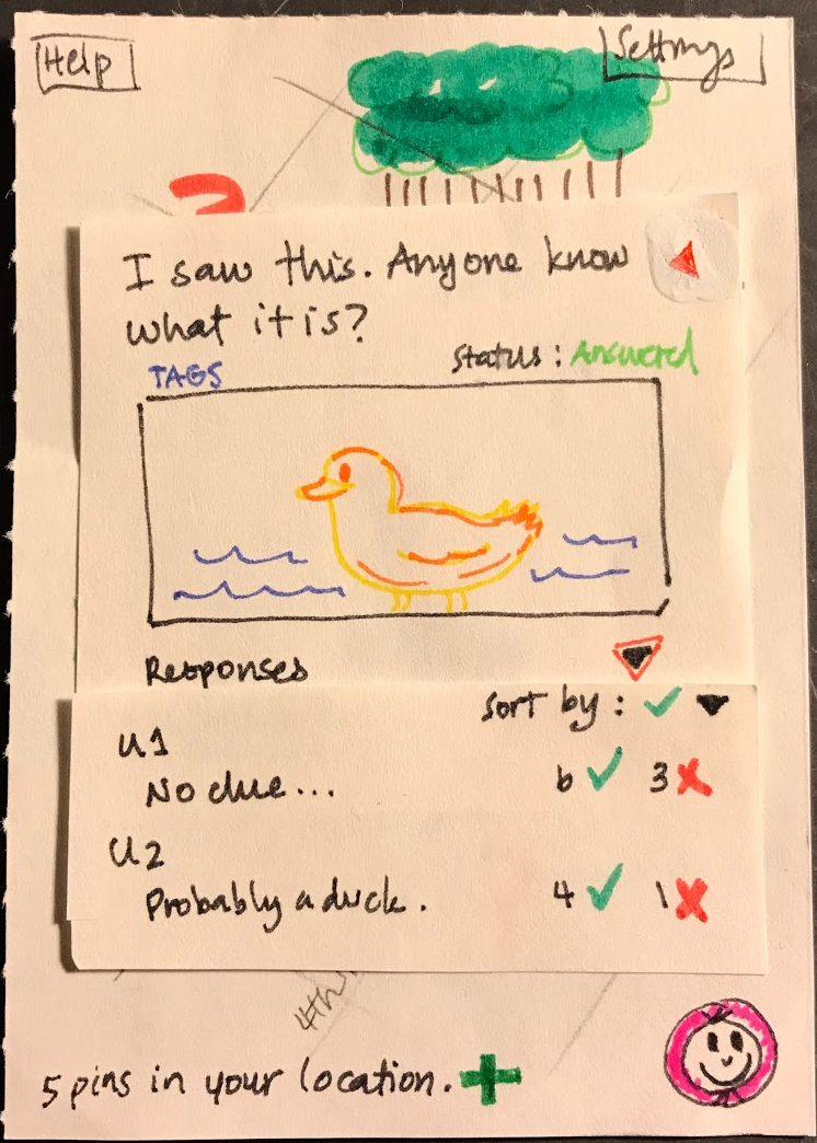
On the text-posting page, the user did not have any intuitive idea as to what the … indicated. It may therefore be important for us to reconsider how we ‘hide’ the additional settings associated with a post. Highlighting the … in some fashion may be an appropriate course of action. This issue has for now been resolved by providing a description for what the … button does in the help section of the application. However, further solutions may have to be developed.
Incident 3, Severity 2
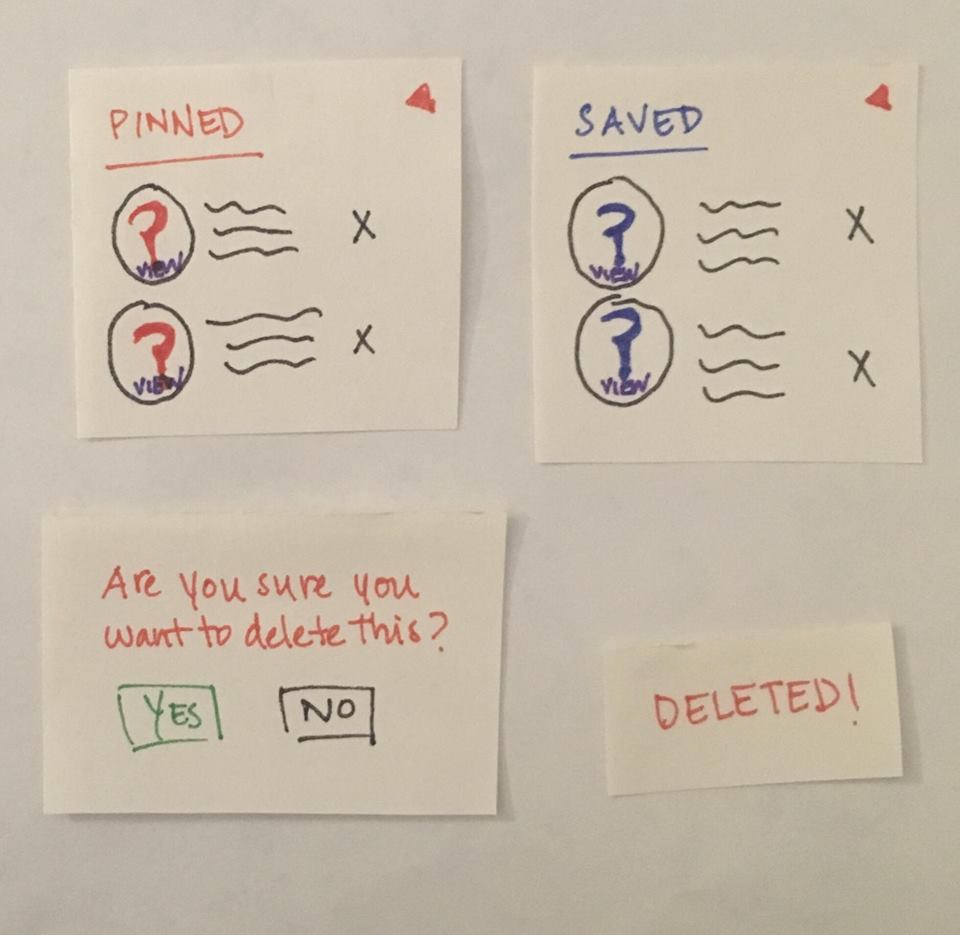
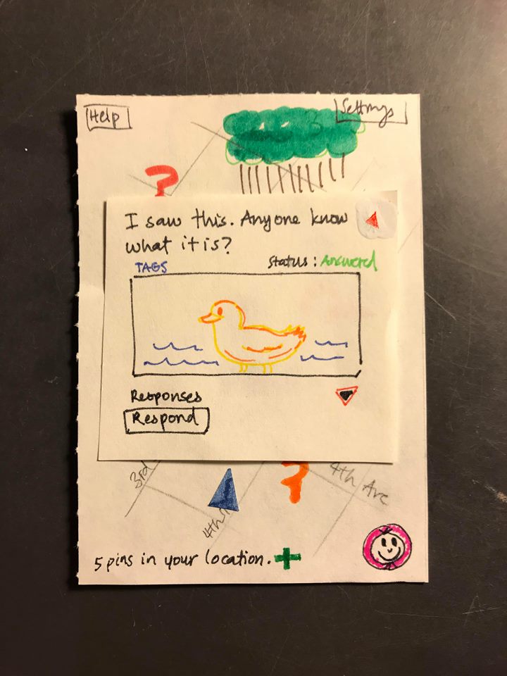
On the question answering page, it was not immediately clear to the user whether or not there were currently responses to a question. While the text above the image suggests that there are answers, the user expected them to be shown as soon as the question was opened. A possible improvement would therefore be to display responses as soon as a question is opened. This issue has been resolved by having the top two responses appear as soon as the question page is opened.
Incident 4, Severity 3
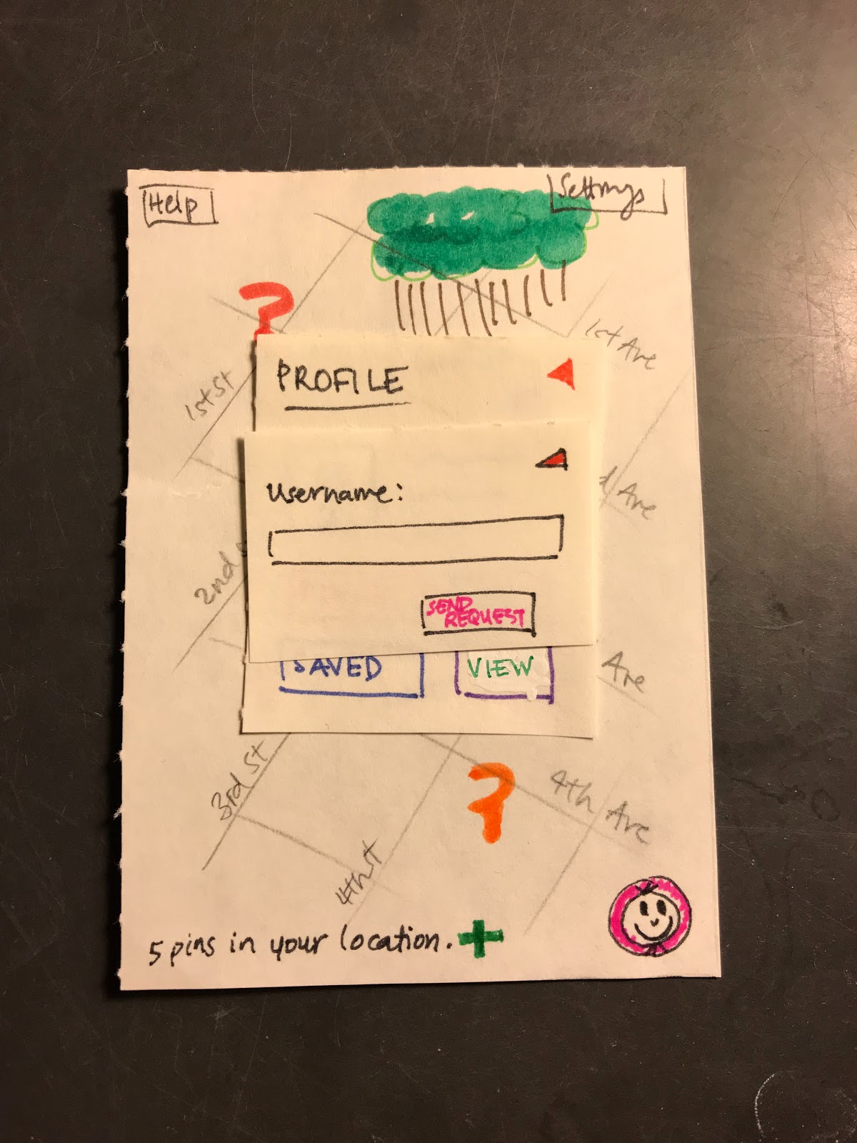
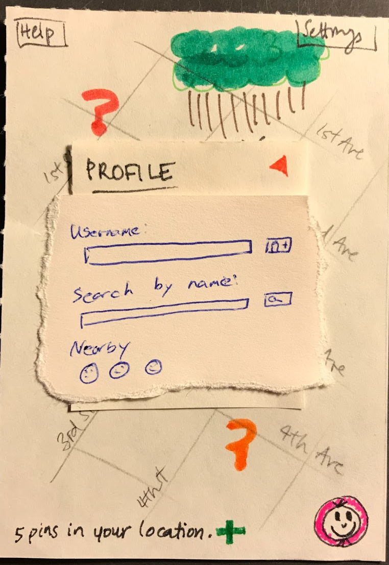
On the page where the user can add friends to the platform, the user did not know the username of any of their friends on the platform and therefore had hoped that there would be a feature to search for friends using something else than their entire correct username. This lack of ability of searching for friends may therefore prevent users from adding friends on the platform. This issue has been resolved by adding a search function on the add friend page where the user can search for people by name, or by proximity.
Incident 5, Positive
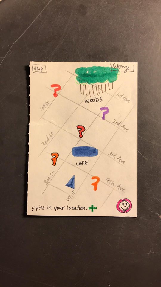
On the main map screen the user had a positive experience. The user felt that the screen was well laid out and easily understood what all of the different elements accomplished. In particular the user felt that the button in the bottom right corner served as a good way to access the user profile page.
Revised Paper Prototype
Here is a link to our revised paper prototype.
Future Plan
When it comes to our subsequent usability tests, we want to make sure that we reach out to people who are in our proposed core user group. We will approach and perform usability tests with users who would consider themselves to be ‘wanderers’ or in other ways explorers of the outdoors, similar to the people we conducted contextual inquiries with. We are also considering performing a usability test with users who are not college students. By doing this we are hoping to ensure that our project would be easy to use by users of all age groups.
Our primary goal for our continued usability testing is to continue to develop an understanding of what issues users may face when using our product. In particular we want to investigate how they may interact with the platform in the longer term once they have some basic familiarity with it. In future usability tests, we will all be playing various roles but we will try to make sure that at least two people are present at a test so that one person can focus on moving the prototype pieces around while another can be interacting with the user. We will also be hoping to perform tests in a version of the product more densely populated by user data to see whether or not our chosen design could become cluttered and as a result difficult to use.