Digital Mockup
Overview
Pin is a mobile phone design. Here is an overview of our digital mockup, created using Balsamiq.
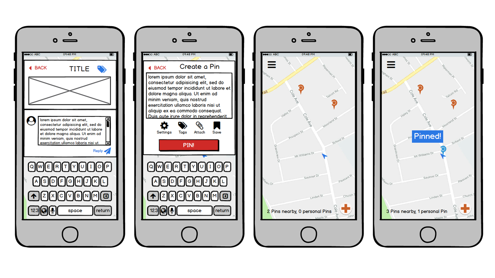
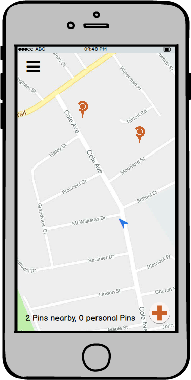
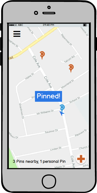
Opening screen. The blue arrow represents current position. The overall background is a map of the area the user is currently in. Pins are visible to indicate other user activity.
Task 1: Asking a Question
Tapping on the button in the lower right corner opens a text box, where the user can write their post.
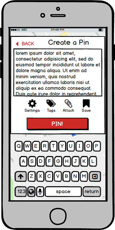
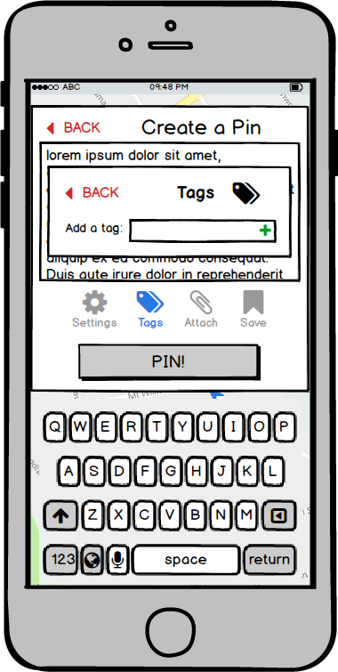
Clicking the TAGS button allows a user to add relevant tags to their post.
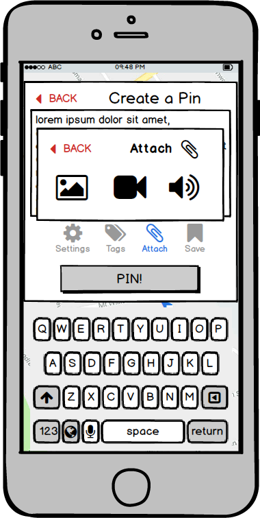
Clicking the ATTACH button allows the user to upload other media, including photos, video, and sound bites. Media can be attached either by looking through items saved on the device or by capturing content immediately from the app.
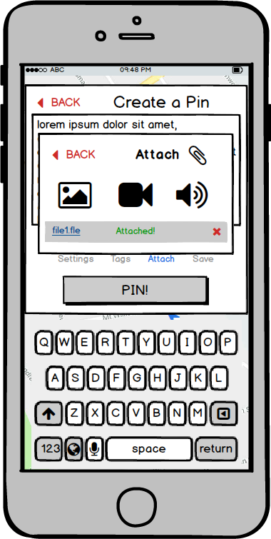
The files are uploaded. Clicking the X next to each file removes that file from the post, and the BACK button on the upload box returns the user to the text box.
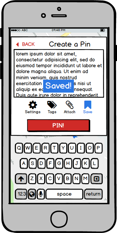
Clicking the SAVE button allows the user to save a pin at a location for later editing.
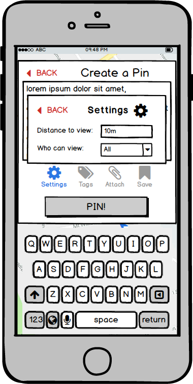
Clicking the SETTINGS button allows a user to edit privacy and viewing options, including the radius of interaction and who the post is visible to. The user can manually edit the radius, but with a lower threshold of 10m and upper threshold of 5km.
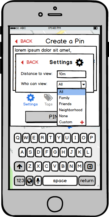
Clicking the “Who can view” menu shows the default options for viewing.
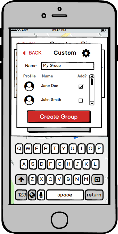
Clicking the + allows a user to create a custom group for this pin and future pins, using checkboxes for people they know.
Clicking the PIN button creates and posts the pin.
Task 2: Answering a Question
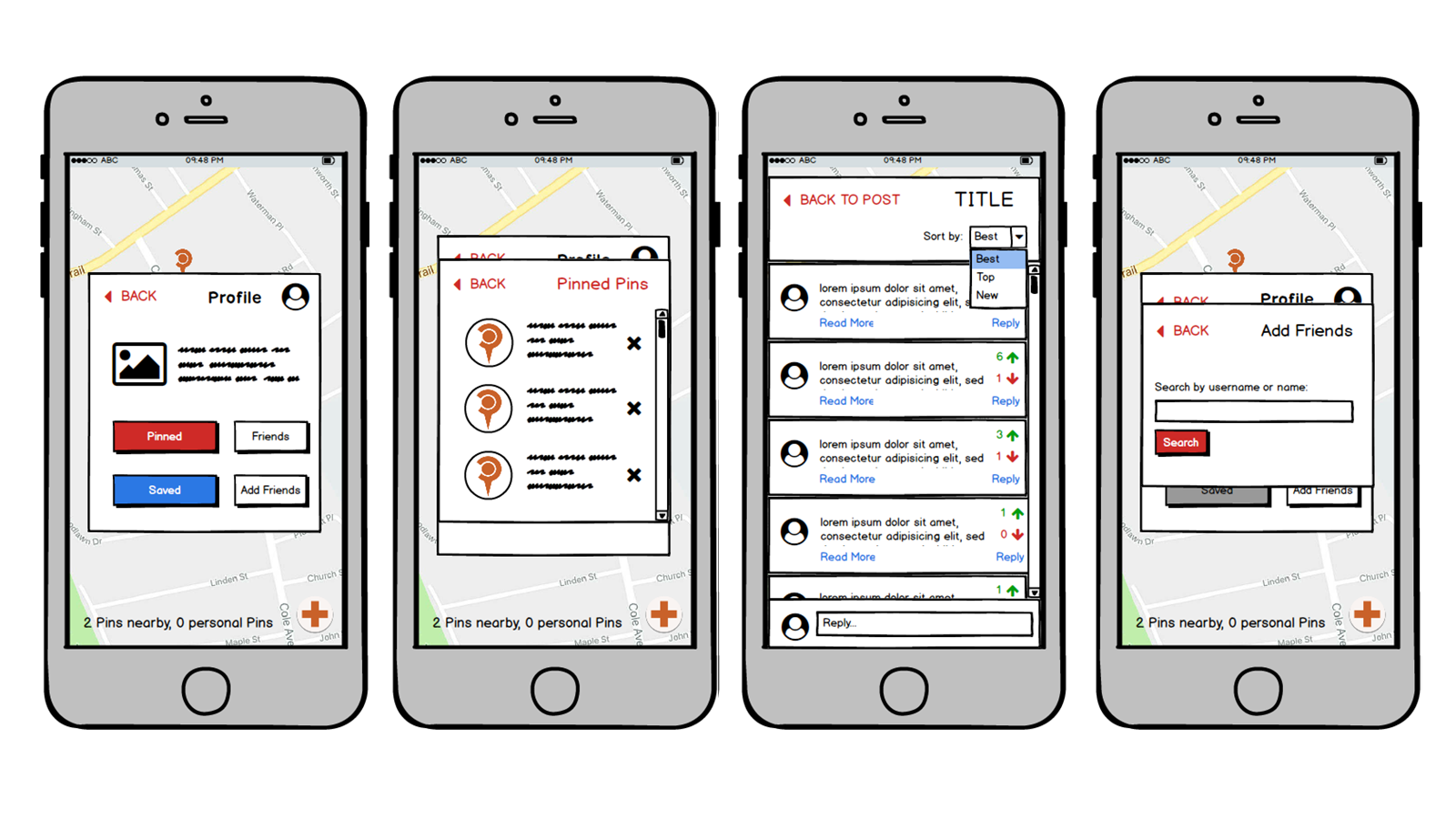
Clicking on a Pin produces the post attached to it.
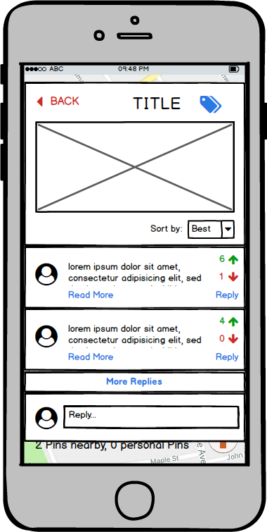
Clicking the MORE REPLIES button sends the user to a page of comments for that Pin.
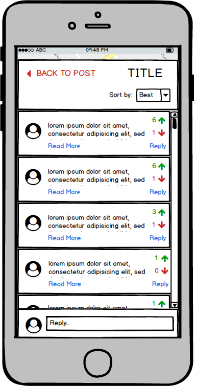
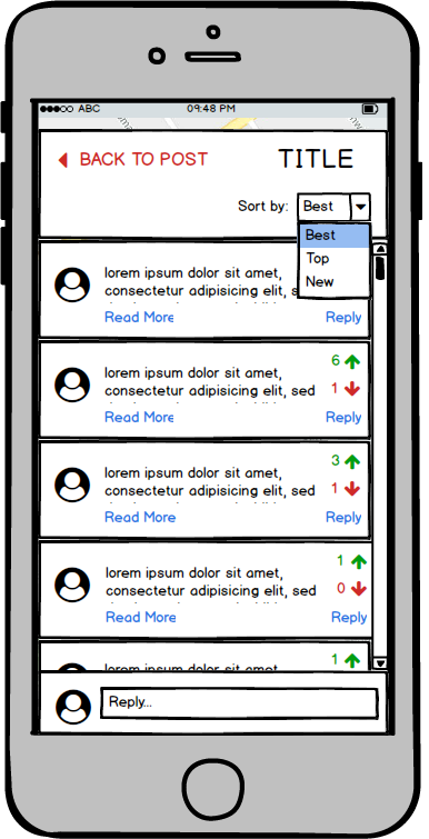
Clicking the Sort By menu allows a user to sort the comments.
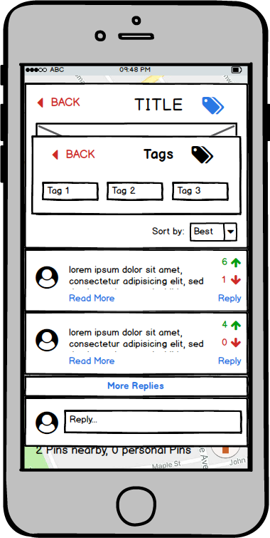
Clicking on the TAGS button shows all tags associated with the post.
Clicking Respond will allow the user to respond to the Pin.
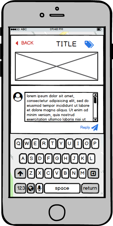
The user will then be redirected to the Pin screen, where they will be able to see their newly posted reply.
Discussion
The overall structure of our design is the same as our paper prototype, but we have fixed many of the issues that arose during our heuristic evaluation and usability testing. The biggest change is the inclusion of a BACK button on every screen; our usage of the BACK button in our paper prototype was inconsistent and left users confused about the navigational structure of our design. Our digital mockup has fixed this issue and ensures that users have clear navigational pathways.
We have also made our buttons much more legible. Our paper prototype was created under the assumption that icons would be intuitive enough for users to understand what buttons do, but that was a poor assumption to make. We have added labels to almost all of our buttons, and fixed the grouping of the buttons on the CREATE A PIN screen to better follow the Gestalt Principles. The buttons are no longer on the corners of the textbox, but rather visibly separated from it.
Furthermore, we have made the “CREATE PIN” button large and visible on the homescreen, and compiled the additional functions into a hamburger menu. This is to emphasize our product’s two main tasks: to see the Pins on the map that other people have created, and to create new Pins.