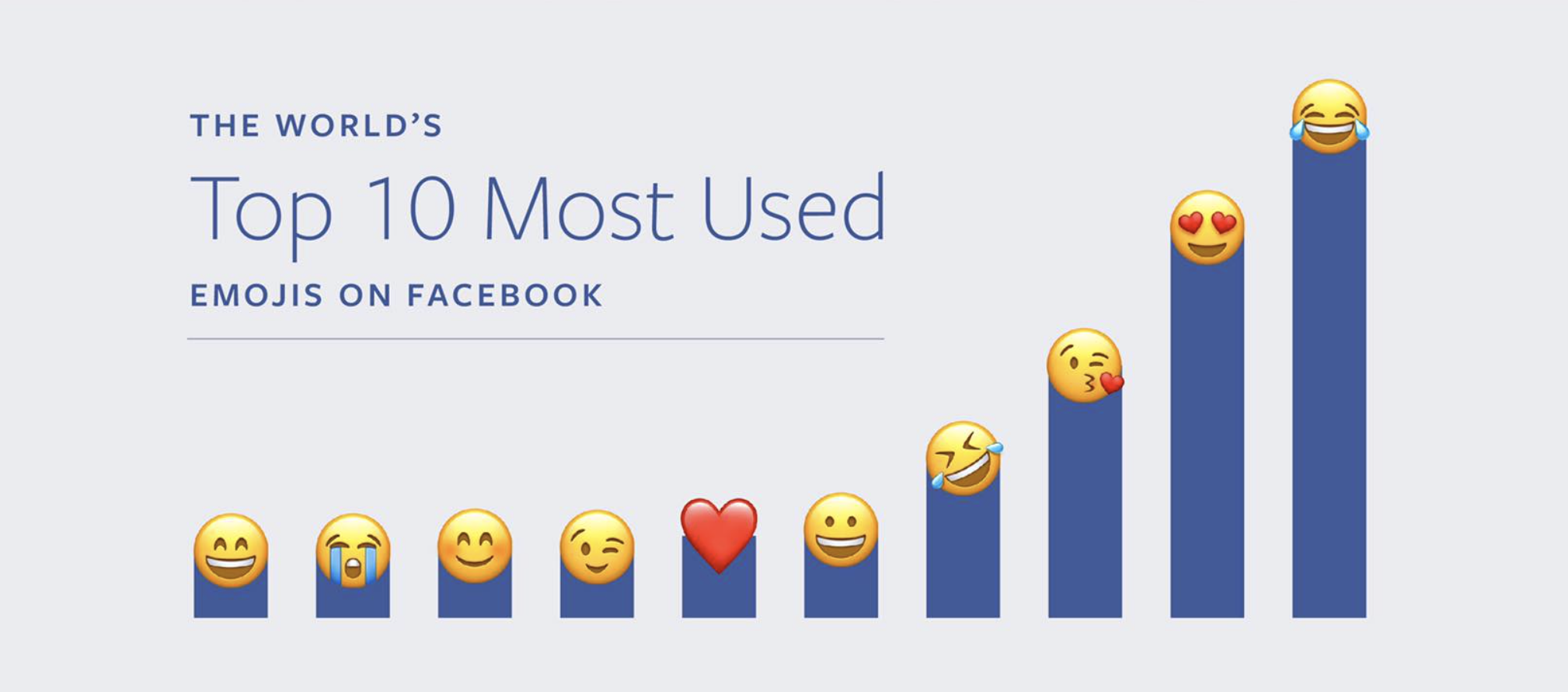
 Source: Facebook
This blog will document my independent study on information visualization. By the end of the semester, I hope to have gained a solid grasp of how and why information is visualized, as well as be able to both create and critically evaluate information visualizations. This introduction will be my first step into the field of information visualization, and there will be a lot of unanswered questions as I think about the material that I come across. These blog posts will hopefully illuminate my process of trying to answer the questions that arise, and in doing so, will serve as a record of what I’ve learned.
Information visualization is all about transforming data into visual representations. These visualizations can be used to explore a dataset, to glean information that may not have been readily accessible from the original dataset. Or they can be used to present information to an audience who may not be familiar with the dataset. Visualizations may also be used to confirm ideas about a dataset.1 Regardless, their purpose is to communicate the data.
Visualizations can look like this:
Source: Facebook
or this:
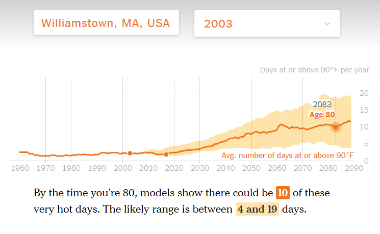 Source: New York Times
or even this:
These are examples of visualizations that I often encounter, and they raise some valuable questions. What’s the purpose of each visualization? What are they trying to communicate? What were the choices involved in making each visualizaton? Are they effective visualizations?
Here are some more examples of visualizations:
Personally, I find myself understanding new material much better when it is visually presented. In The Functional Art, Cairo much more elegantly describes data visualizaton as preemptively aiding the transformation of raw data into wisdom.2 A visualization reduces the viewer’s cognitive load by taking an unstructured stream of data, adding order to it, and presenting that data in a summarized and highlighted manner. There are fewer mental steps that a viewer has to take to understand the data because the visualization has already done some of those steps.
It is important to keep in mind that not every visualization may add the correct structure or order, or present the right data. Some visualizations may even aim to mispresent the data, so even though work is being done for the viewer, the viewer must be cognizant of what that work is.
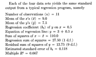
A visualization may reveal unnoticed trends or patterns in the data that could not have otherwise been discovered. Consider Anscombe’s quartet, which are datasets created to illustrate this purpose.3 These four scatterplots each contain eleven points and have nearly identical descriptive statistics. As pulled from Anscombe’s paper:
When graphed, however, one can quickly see that they have distinctively different patterns.
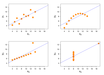
Though the quartet is artifically created, one can imagine similar situations in which patterns cannot be unveiled from just looking at the numbers, and how visualization can be useful in exploring and analyzing a dataset.
It is also important to realize that not every dataset benefits from visualization!
There are a lot of different types of information visualizations, and they vary depending on a lot of different factors. Creating a visualization is a human-centered design process. It involves sketches, prototypes, testing, iteration, evaluation. Who’s the audience? What’s being communicated? Is the design legible? Does it look good?
There are many, many possible ways to visualize the same dataset, and there’s never a best one. In creating and designing a visualization, there are a lot of tradeoffs and decisions that must be made. What type of chart is best suited for what kind of dataset? What types of charts are even out there? What types of datasets? How does one critique a visualization?
This article by Fernanda & Martin on design and redesign touches on a lot of these questions. Redesigning a visualization can be a form of critique, as it is clear what is changed between versions. It’s important to think about the different expectations that a viewer might have for a visualization, and how both the designer and the audience play a part in making a good visualization.
This post on Storytelling With Data discusses redesigning visualizations for their makeover challenge, and is something I will participate in when I am more experienced in creating visualizations! As I begin to create my own visualizations, I will address and hopefully answer some of these questions about the design process.
This is a list of readings that influenced this blog post, though they are not explicitly mentioned elsewhere.