It’s not quite September anymore, but I figured the September #SWDChallenge would be a good way for me to practice evaluating a visualization and remaking it! The challenge contains several useful tips for evaluating graphs, as well as some questions to consider when thinking about the remake.
I will be learning how to use Tableau for this challenge.
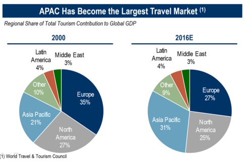
This is the original graph:
My eyes are drawn to the title, and then to the Europe slices, which have the same color. The Europe slices have the most contrast and also seem to be the biggest, but the title implies that the focus should be on the Asia Pacific slices. The pie charts are cluttered and difficult to read, and there isn’t a good resting place for my eyes after I read the title. My intuition is to tone down the different color choices and use fewer ones to emphasize the point of the graph, which is to highlight the change for Asia Pacific.
Since the focus seems to be on the rise of Asia Pacific’s travel market, a graph that highlights change between two times would be good. Though not explicitly highlighted, the decline of Europe’s travel market may also be of note. The use of a pie chart might be to show each region’s relation to the global travel market, but that seems to be less important than communicating the difference between 2000 and 2016E. A slope graph or a grouped bar chart might be better for getting that difference across.
The takeaway seems to be the title of the graph, but the pie charts themselves don’t really contribute to that. Using a different graph would help bring the focus on Asia Pacific’s growing travel market. The only data available to us, however, is the percentage of each region’s travel market compared to global GDP. The information available suggests that more people are traveling to Asia Pacific in 2016 compared to 2000, or that Asia Pacific is growing in popularity in terms of travel destinations. This may be of interest to the travel industry, or to people who are looking to expand their businesses to another area. This chart motivates people to look more into the reasons for Europe’s decline and Asia Pacific’s rise in the global travel market.
We are only given percentages, but having absolute numbers would give viewers a better understanding of the global travel market. Has the travel industry as a whole grown from 2000 to 2016? Are there specific subregions of APAC that are responsible for its growth? Similarly, is the travel industry declining overall in Europe, or is it still growing, just at a slower rate than that of APAC? The current numbers give a possibly misleading representation of Europe’s travel industry as declining, but specific numbers would show whether that was true. Furthermore, who is the intended audience? What information do they need to know, and what kind of information are they looking for? How much do they already know about the travel market?
The original chart’s data was sourced from the World Travel & Tourism Council. Their website includes a tool that generates interactive visualizations, and more importantly, provides absolute numbers. The numbers below are listed as nominal(real) in billions of USD.
| Region | 2000 | 2016 |
|---|---|---|
| Asia Pacific | 870.5 (1181) | 2492 (2548) |
| Europe | 1203 (1861) | 1975 (2020) |
However, these numbers don’t quite fit with our original data! Quick arithmetic with these numbers and the percentages given result in different numbers for total contribution to GDP of the travel industry. I do not feel confident in including these numbers in the visualization, but they do give me a better picture of the travel industry as a whole. These numbers tell me that Europe’s travel industry is still growing, but at a much slower rate than that of APAC’s travel industry. This is important context to have, as it clears the misconception that Europe’s travel industry is declining.
While I originally wanted to emphasize both Asia Pacific’s increase and Europe’s decrease in percentage points, I realize that highlighting the latter would be misleading. Rather than portraying a decrease in Europe’s contribution, the focus should be on the original title: that Asia Pacific has become the world’s largest travel market.
I know that I want to highlight Asia Pacific’s change between 2000 and 2016. Tableau quickly generates basic visualizations, and after messing around with stacked bar charts and line charts, I think a slopegraph would be most appropriate.
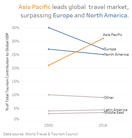
I imagine that this graph would be placed alongside more detailed information on global travel markets, and serves only as a cursory overview of a longer discussion on the growth of Asia Pacific’s travel industry. The original pie chart If I had more consistent numbers, I would have placed them alongside the slope graph to give more context at a glance. This slopegraph still gives the impression that the travel industries of Europe and North America are declining, however. This issue can be solved either by accompanying text, or by including the absolute numbers in the graph.
This makeover by Kat Greenbrook is super informative! Plus the animation is nicely done.
This tutorial on slopegraphs was very helpful!