Usability Testing Review
Discussion
All three usability tests were conducted on Williams students with limited experience in interface design. We chose our participants because our primary stakeholders are college age students that either already frequently use mobile apps or are welcome to the idea of using their phones while outdoors. Our design is meant to be used outdoors and under different weather conditions, but it would be very difficult to replicate such an environment using a paper prototype. Thus, we decided to conduct the usability testings in quiet, distraction-free settings: the first one in Paresky Center, and the latter ones in Eco Cafe. These settings allowed the user to concentrate purely on the design in front of them.
The structure of the three usability tests remained the same. The user was given a brief description of our app and told to imagine walking outdoors. The user was then asked to create a Pin and attach a media file. Afterward, the user was asked to leave a comment on an already existing Pin. The first test was conducted by Karl, who acted as the human computer and facilitator. The latter tests were conducted by Lester as facilitator and Alyssa as the human computer. We made several revisions in our process and prototype over the course of our testing.
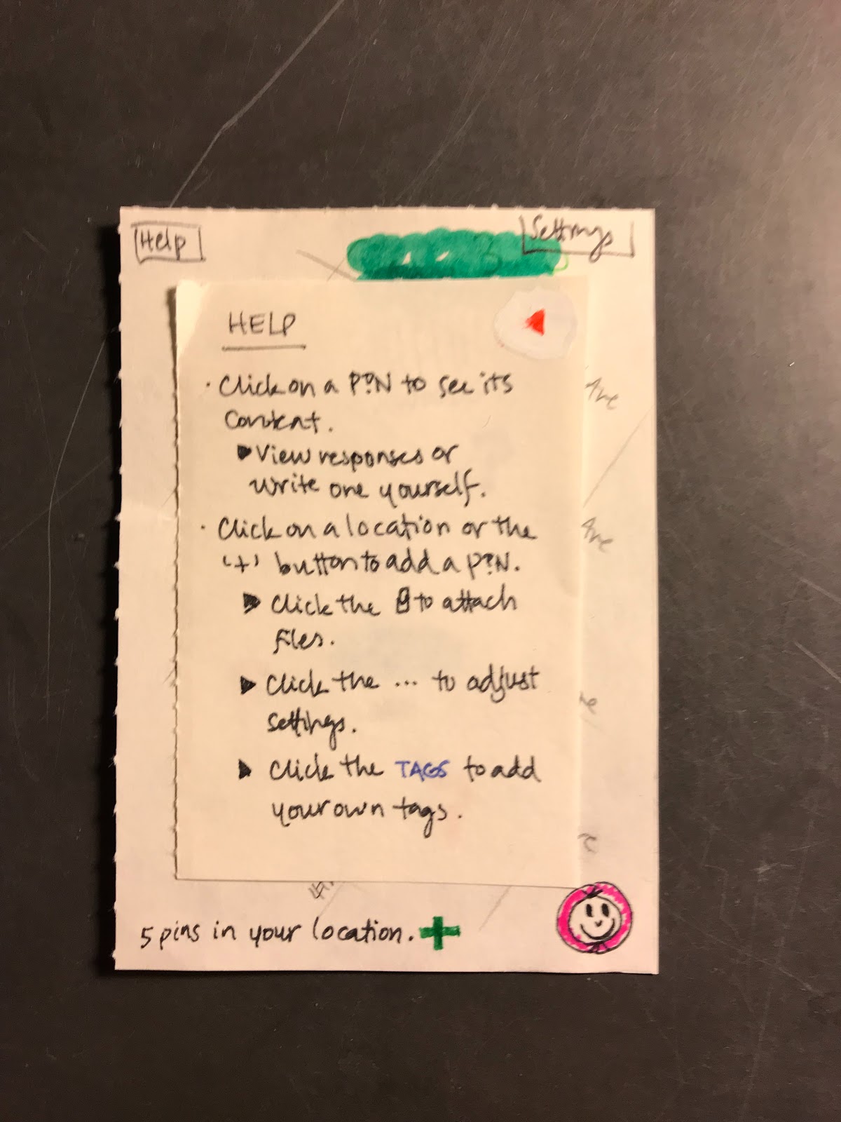
We added to and elaborated on our initial descriptions, since users seemed unsure of what the app was designed for. We also added help screens and back buttons, since our main issue was that users found themselves stuck and confused about the purpose of their task. We got better at conducting usability tests!
Incidents
Pin Placement: Severity 1
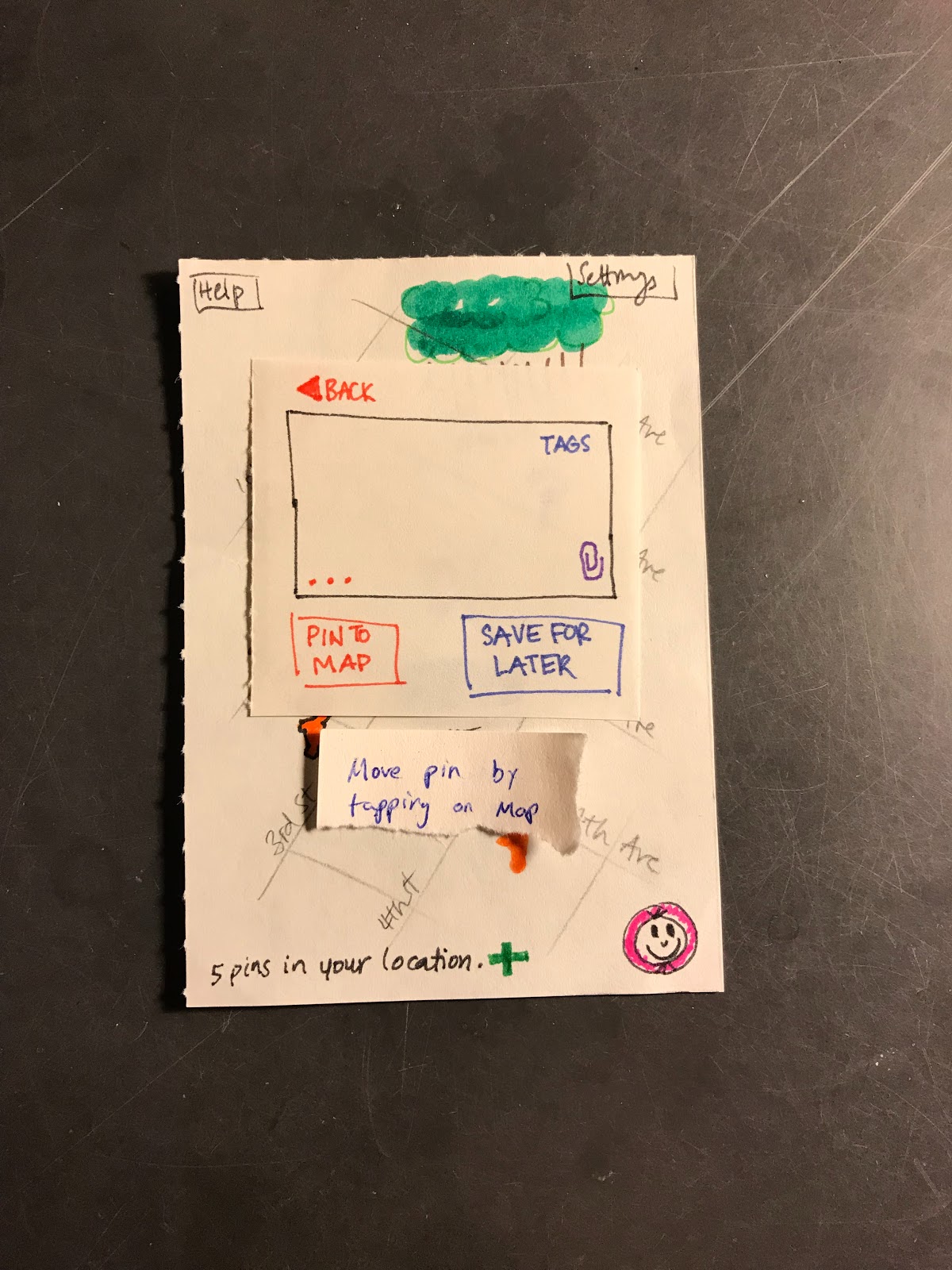
When the user was on the posting page they did not realize that they could move the pin that they had placed simply by clicking outside of the pin entry window. This is an issue as we had decided that we would allow users to move their placed pin by tapping outside of this window and then dragging the pin on the map. This issue has been resolved by adding a small pop up that appears outside the main text entry window alerting the user to the fact that they can move the pin if they so wish.
Button Confusion: Severity 2
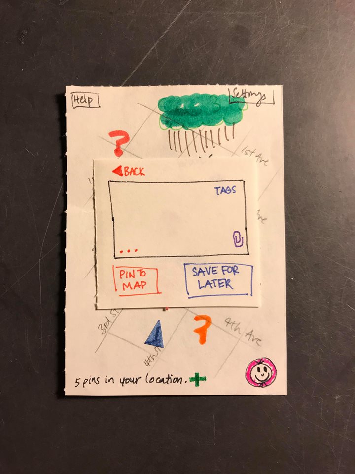
On the text-posting page, the user did not have any intuitive idea as to what the … indicated. It may therefore be important for us to reconsider how we ‘hide’ the additional settings associated with a post. Highlighting the … in some fashion may be an appropriate course of action. This issue has for now been resolved by providing a description for what the … button does in the help section of the application. However, further solutions may have to be developed.
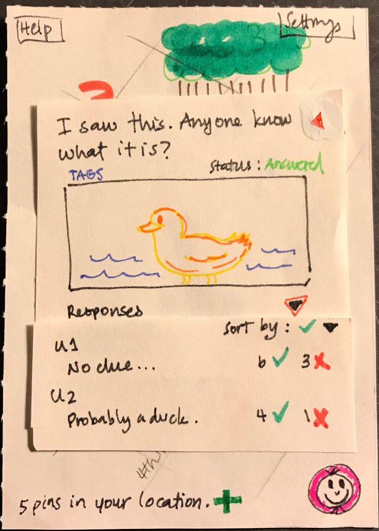
Interface Confusion: Severity 2
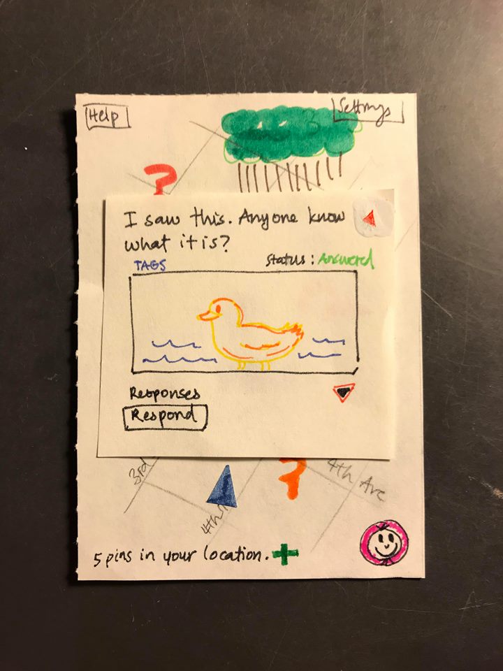
On the question answering page, it was not immediately clear to the user whether or not there were currently responses to a question. While the text above the image suggests that there are answers, the user expected them to be shown as soon as the question was opened. A possible improvement would therefore be to display responses as soon as a question is opened. This issue has been resolved by having the top two responses appear as soon as the question page is opened.
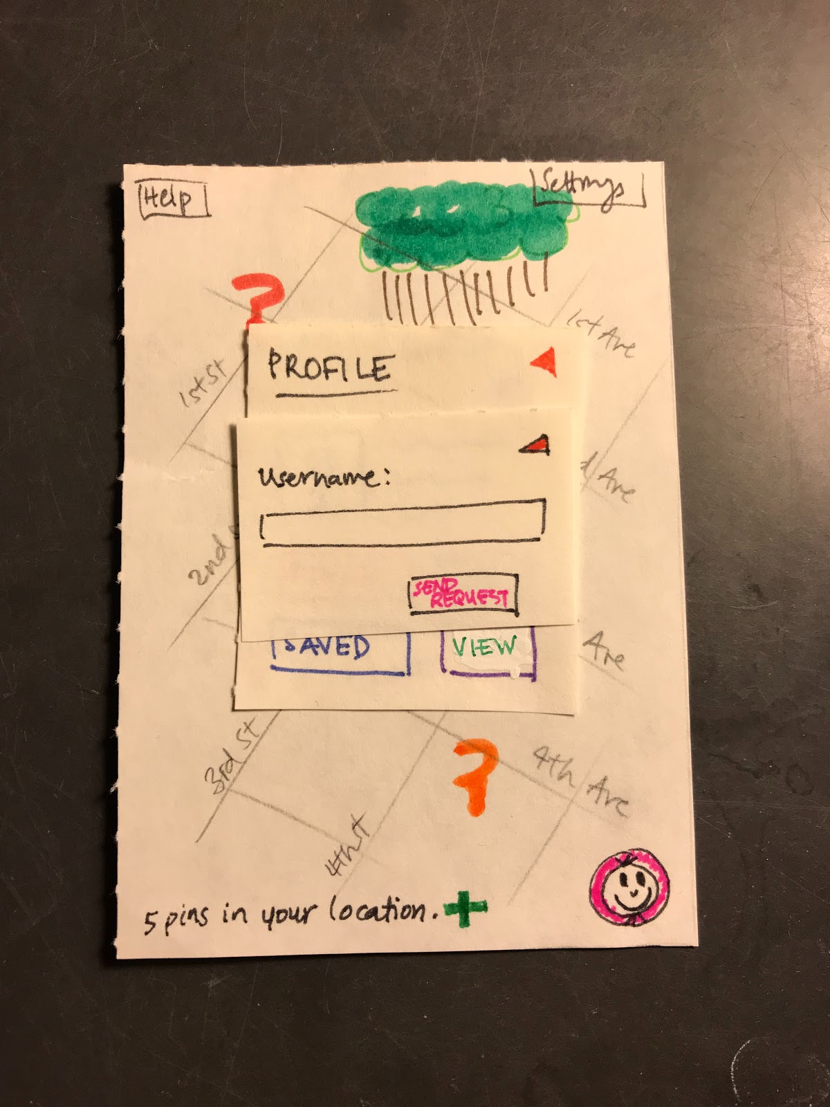
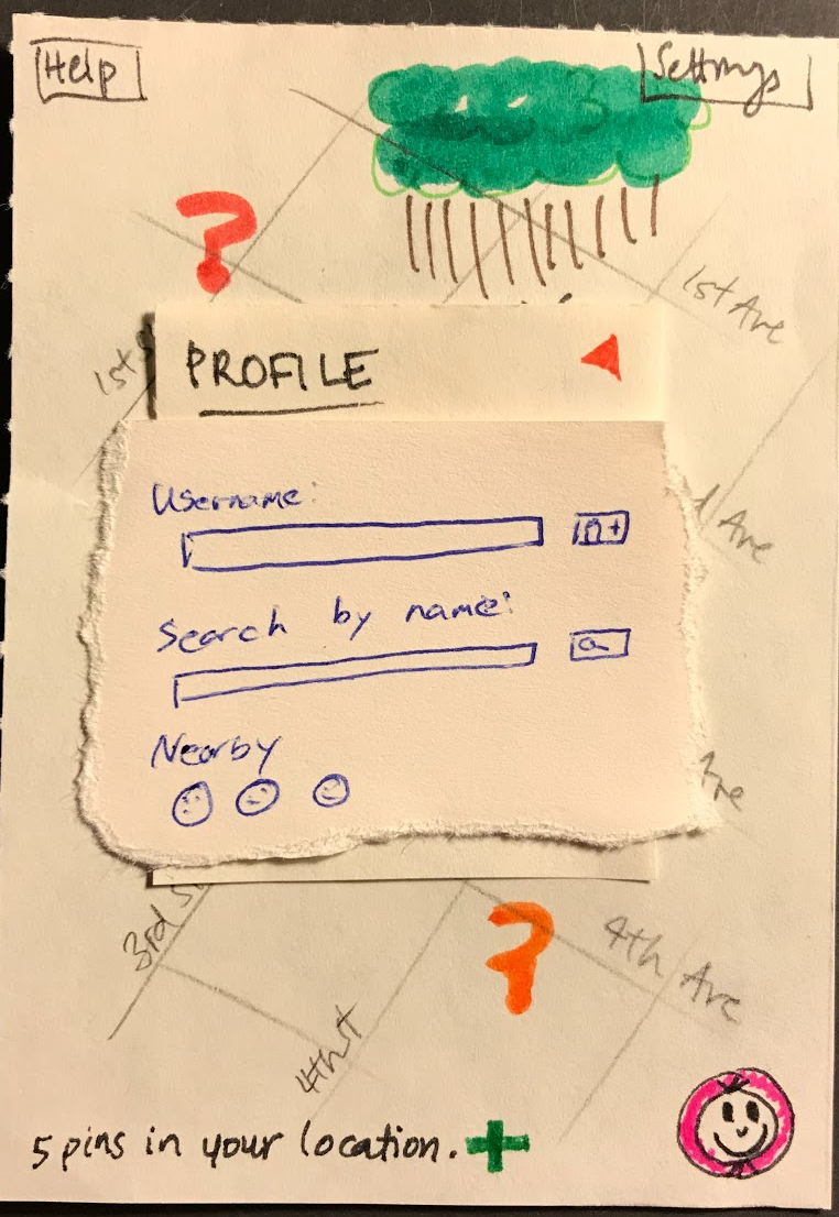
Friend Search: Severity 3
On the page where the user can add friends to the platform, the user did not know the username of any of their friends on the platform and therefore had hoped that there would be a feature to search for friends using something else than their entire correct username. This lack of ability of searching for friends may therefore prevent users from adding friends on the platform. This issue has been resolved by adding a search function on the add friend page where the user can search for people by name, or by proximity.
Positive
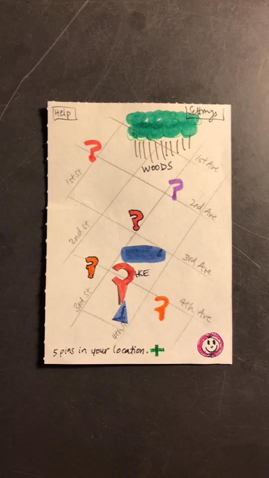
On the main map screen the user had a positive experience. The user felt that the screen was well laid out and easily understood what all of the different elements accomplished. In particular the user felt that the button in the bottom right corner served as a good way to access the user profile page.
Positive
Use of back buttons to navigate out of windows is intuitive.
Positive
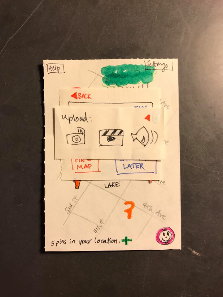
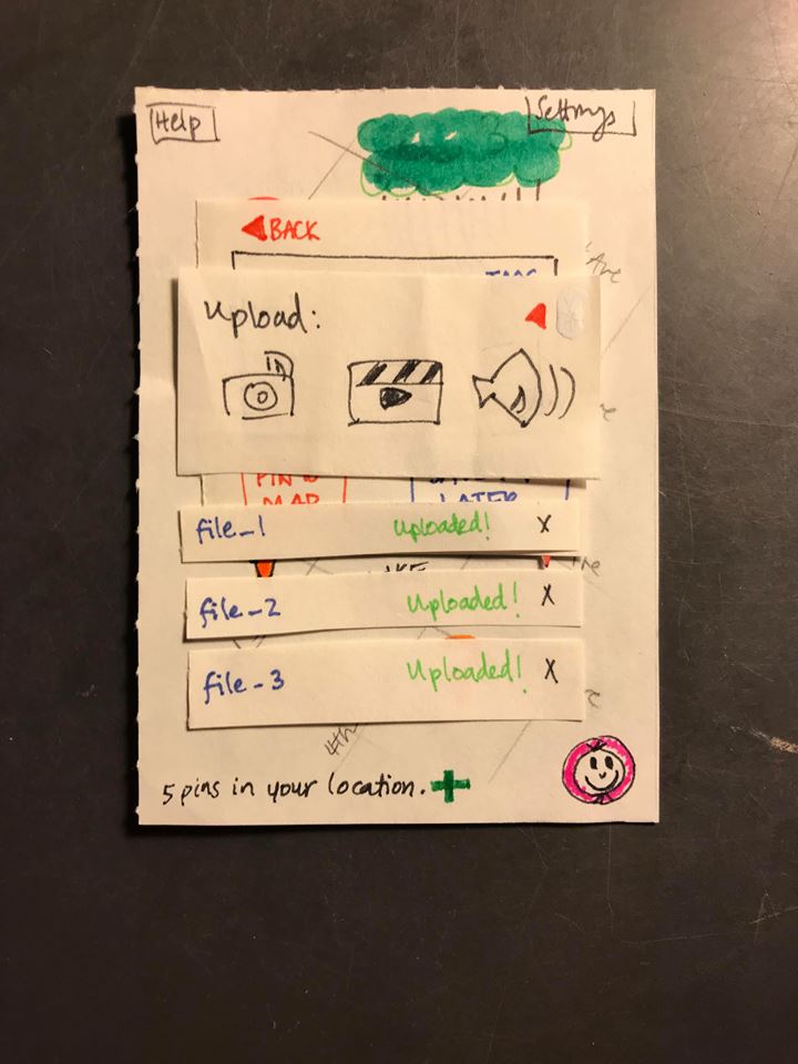
“Upload” screen is clear about what the user intends to upload.
Positive
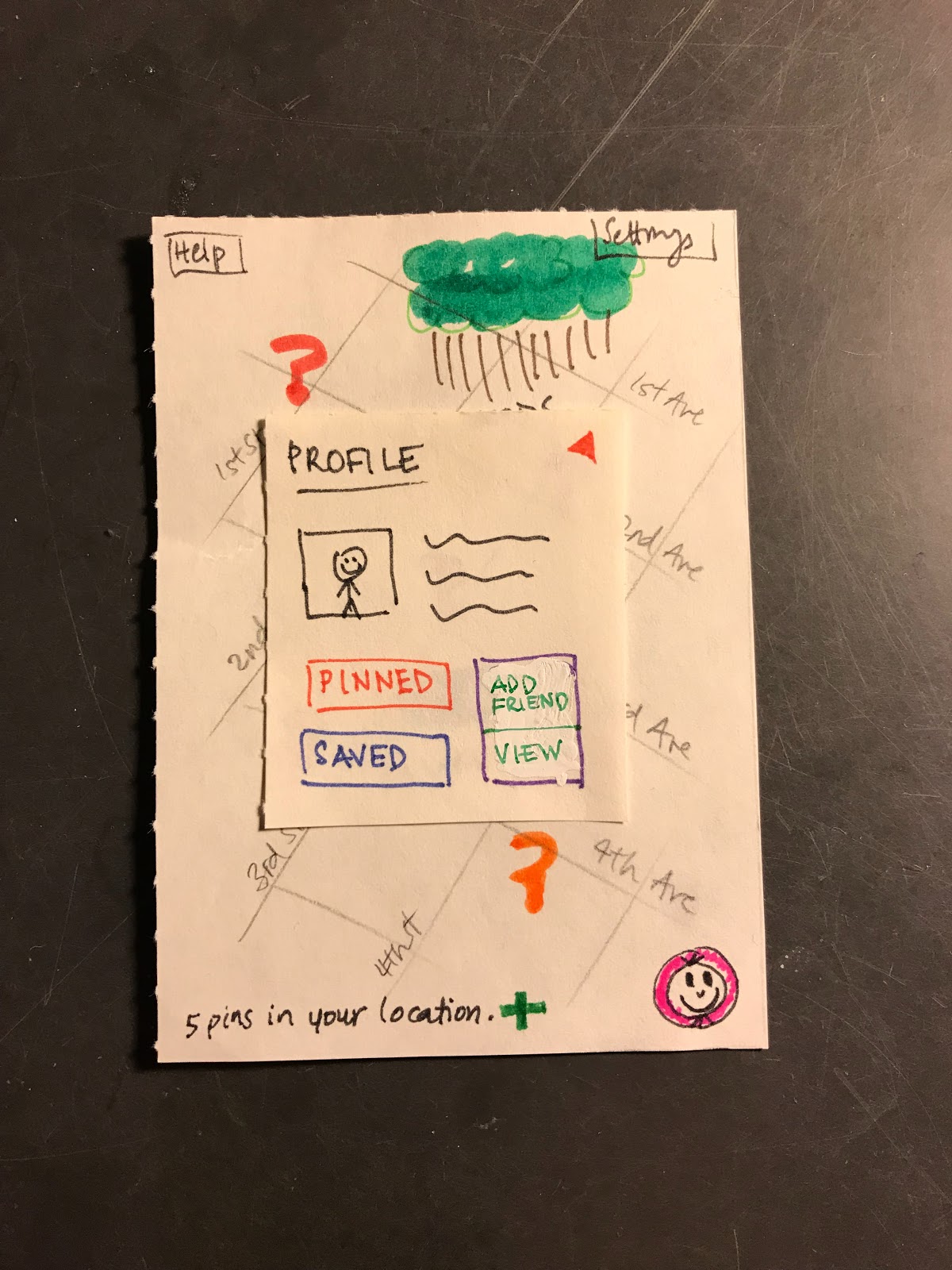
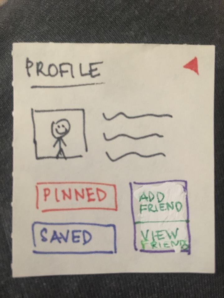
“Profile” screen engaged users with the app, encouraged customization (Note: will need more conversation about anonymity)
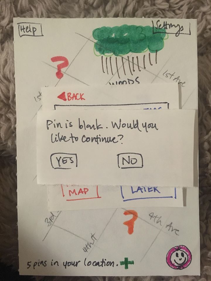
Blank Pin: Severity 3
Users created blank pins and then were unsure about how to add content after. Revision: Added alert box.
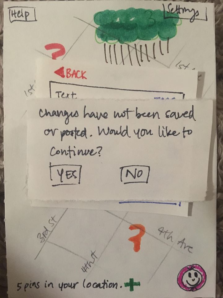
Autosave: Severity 3
User edited a pin but assumed their changes autosaved. Revision: Added alert box.
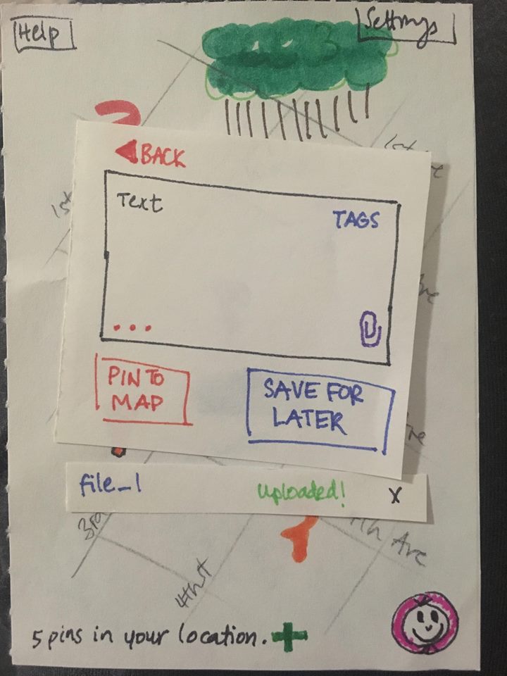
Button Confusion: Severity 3
Users were confused about the functions of “Pin to Map” and “Save for Later” buttons. Revision: Will move “Save” button to separate it from the “Pin” button. Will make the “Pin” button more obvious.
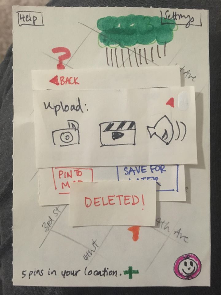
Deletion: Severity 2
User deleted photo when attempting to leave the “Upload” window (confusion about “X” button). Revision: Added “Deleted” alert.
Button Confusion: Severity 1
Not enough detail about “View” button in Profile (user unsure about what it did). Revision: Changed button label.
Interface Confusion: Severity 1
User was unsure where text box was (due to other buttons in the corners). Revision: Will change layout of box and buttons and add placeholder text.
Media Uploaded: Severity 1
Users were unsure if media was still attached after leaving “Upload” window. Revision: Kept uploaded media on the screen.
Revised Paper Prototype
Here is a link to our revised paper prototype.
Results
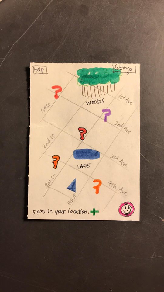
Throughout the testing process we learned several things. A primary lesson was that we had no help system, and the user had nowhere to turn when they weren’t sure what they were supposed to do. We also learned that our labels (color of pin, icon of button, label of button, etc) weren’t as intuitive as we imagined, and that we needed to be more explicit and consistent with how we choose the labels. We also needed to give more feedback to the user on what their current state is. Additionally, we assumed our app’s map interface/metaphor would give more information about its functionality than it actually did.
When it came to our paper prototype we also developed a better understanding for its features and shortcomings through in-class activities where our prototype was critiqued by other groups in the class. The heuristic evaluation was such an activity. During the heuristic evaluation it for example became clear that the two button we had designed for saving a pin for later and posting a pin where easily confused. By writing ‘save’ on one and ‘pin’ on the other the evaluator were concerned that users would think ‘saving’ would mean the same as ‘pinning’, especially since the two buttons were placed right next to each other. We initially changed the label of the ‘save’ button and later on moved it away from the ‘Pin’ button.
One salient and important modification to our paper prototype is adding back buttons! This modification is very important because users were confused about the navigational structure of our design, and this confusion could easily have led to difficulty in navigation. We had originally planned for users to leave a screen by tapping the background or another screen, but our usability tests showed that this action is not intuitive. Adding back buttons allowed users to feel more comfortable navigating our design.
A second important revision that we added to our design was the introduction of more feedback to the user when it came to alerting the user that certain actions have been performed. For example, when posting a pin, in addition to the pin showing up on the map, there is also a pop-up window which says “Posted!”. Through our study of interface design the importance of immediate feedback when a user performs an action. By providing confirmation that the pin the user has been working on has been posted the user does not need to wonder whether the pin has been posted or not.
A third example of a revision that we performed that proved to be an important step in improving our design was the clearing up of what the save button and pin button did respectively. While the save button is only a minor feature allowing users to return to a pin which they have previously been working on the pin to map button is an essential component of our project. Increasing the size of this button and using color to make it stand out next to the save button was therefore an important step in making it clear to the user which button to press the first time they are using the app.