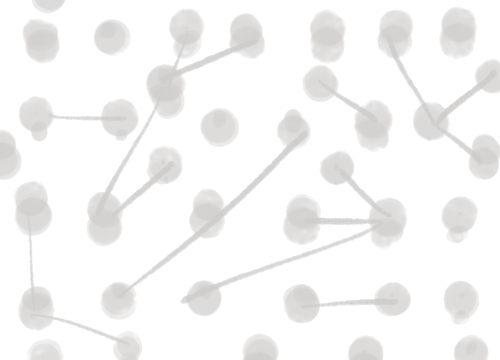
In addition to the visual features from last time, I’ve also processed exhibition data to get a better sense for how pieces may be related to each other. I used NetworkX to construct a graph where each node represents a work of art in the collection and an edge between two nodes represents an exhibit that both were in. My code can be found at make_exhibit_graph.py. The simplest way to visualize this information may be something like this:
First, an overview of the collection. The nodes / artworks may be represented by thumbnails, colored shapes, text, etc. Faint edges represent connections between pieces.
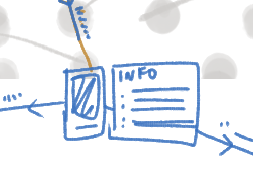
Upon zooming in on a particular piece in the overview, more detailed information about the piece is pulled up, such as medium, artist, time created, etc., and the piece’s connections to other works are highlighted.
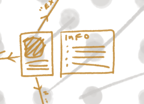
Clicking on one of these collections will put the new piece into focus, and highlight the new piece’s connections.
Something like this will allow an audience to quickly get a sense of the collection as well as what connections between pieces exist, and also to zoom it on a particular piece to get more information. Filters may be used to limit the number of artworks that appear in the graph, allowing users to see connections given certain constraints: for example, how connected are prints? How connected are monochrome photographs?
I want to make an interactive visualization of the WCMA dataset that allows for quick scans of the collection, but also encourages deeper exploration.
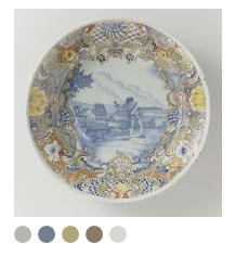
A graph visualization can communicate more than just the exhibition data. For example, this coin visualization is super inspiring, and shows how a lot of objects can be displayed and organized on a flat surface. The coins can be dragged around and filtered through a number of attributes, and there are preset configurations as well.
Although there are a lot of coins, clustering the coins together helps present the information in a neat and clear fashion. We get a good sense of the overall collection without losing any of the details, since we can zoom in and get more details about any single coin. There are multiple layouts to present the same information, and clicking attributes automatically reorganizes the coins. This example gives a lot of insight into how a large collection of objects can be visualized well!
Art Palette by Simon Doury and Etienne Ferrier is also very inspirational. This Google experiment associates artwork with color palettes, and allows users to browse through pieces with a given palette. The results are shown as a mosaic of thumbnails. It’s possible to find a wide range of different pieces that share the same colors!
How would each piece in the collection be represented?
Art Palette simply displays each thumbnail above its palette, which could also work for my visualization:
For a more abstract approach, each piece could be represented as a filled-in shape:


Using shapes also affords another encoded attribute, since each shape can represent one category. However, this may require a large legend, which can be undesirable. Abstract shapes also allows for quick clustering and scanning of the collection, similar to how the coins were organized.
The visualization doesn’t have to use only one representation! When zoomed out, the visualization could show organized shapes, and when zoomed in and filtered, the shapes could turn into thumbnails to indicate that more detail is available for each object.
These other visualizations could be incorporated as a feature in the bigger graph, similar to the coin filters.
How has the color makeup of the collection changed over time? Are there moments in the collection’s history when the dominant colors of the palette were drastically different? Is there a relationship between the creation date of an object and its color palette?
One way of visualizing this information would be a scalable timeline that starts from the earliest date to current times. The colors could be represented as liquids in a pot, paints on a palette, sections of a rectangle, etc.
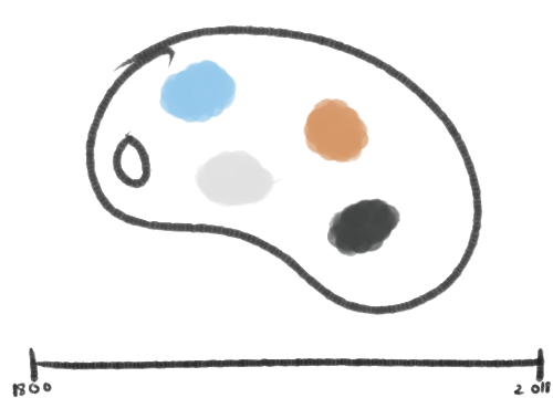
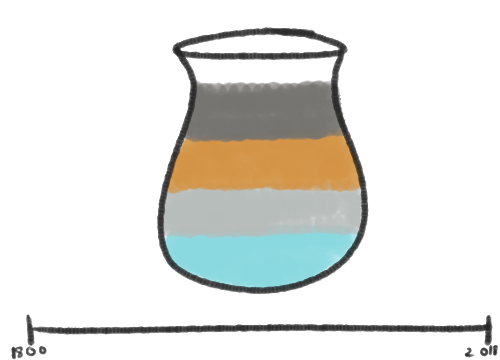
Dragging either end of the timeline will update the colors.
Focusing on a specific point in time will show the color scheme for that point.
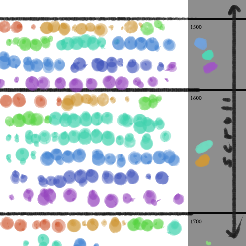
Here is another sketch of a possible visualization; on the right is a timeline that stretches vertically, and time periods are sectioned off on the left. Each section on the right contains the dominant colors for that time period. Each section on the left side contains all the thumbnails of objects made within that time period, and these thumbnails are sorted by their dominant color.
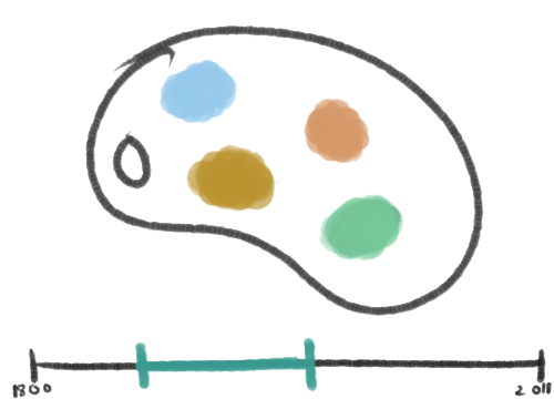
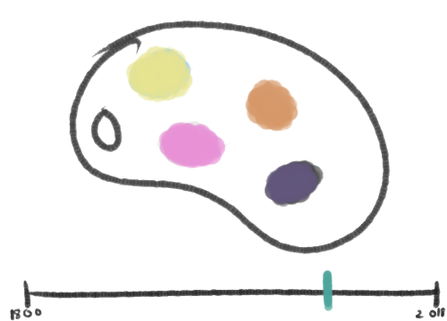
Another relationship to think about is the color palette of each classification of the collection. For example, how different in color are the prints compared to the sculptures? This could be a standalone visualization, but also an addition to the previous timeline one: by treating how the colors are presented as a way to represent the classification. One or more classifications could be chosen from a list, and the corresponding containers would appear.
Here is an example of what that may look like:
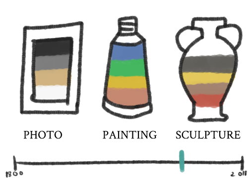
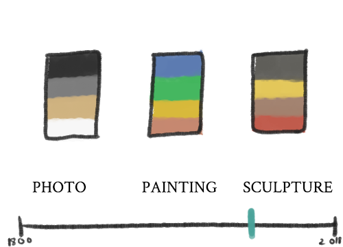
This may not be the best way to represent classification, since it might be difficult or even essentializing to choose an object that represents Prendergast, or Eastern, for example. Additionally, the classifications don’t all fall in the same category, and thus the icons would be inconsistent. It might be better to use medium as a way to filter objects, but medium is not a great attribute to use given the current dataset because of its inconsistentency (as discussed previously). One way to avoid this problem would be to use labelled buckets, like so:
Another problem with using classification is that some classifications wouldn’t make sense with the timeline, as they categorize the pieces of a specific time period: most noticeably, the ANCIENT classification. In these cases, it may be better to leave out the timeline altogether.
Google Arts and Culture has done a lot of cool stuff with museum collections.