Explore WCMA is a way to find pieces in the collection that you haven’t seen before by following an artwork’s connections through exhibits. You can also get a quick sense of the color scheme of each exhibit! This blog post will document how this visualization came to be.
I had worked with the WCMA dataset earlier on in the year, and this visualization was a good opportunity to put together what I’ve learned. After processing the dataset and doing some preliminary visualizations, I wanted to do something more with the data. I talked to several people about their experiences with the museum’s collection (more details here), and an idea formed: to visualize the collection in a way that entices exploration, while also giving visual details about the pieces. The visualization would focus more on allowing users to explore the collection and find pieces that they had not seen before.
First, I did some sketches of what such a visualization would look like. I knew it would be a network of some sort, since that allows people to get not only a quick overview of the overall composition of the collection, it would also show relationships between different pieces and allow users to explore these connections. I used D3 to build a first draft of how such a network would be displayed.
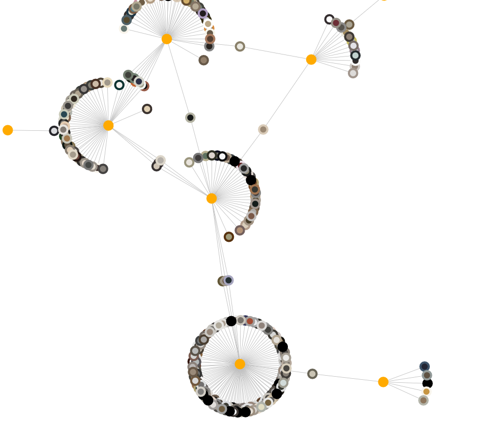
However, I quickly ran into some issues. I had originally connected pieces that had been in the same exhibits together, but that turned into hundreds of thousands of connections, and it made the visualization unusable because it took so long to load. Additionally, there was too much information to take in, and it was visually overwhelming. I decided to re-implement how the network would be created; instead of connecting pieces to each other, I introduced new nodes for exhibits, and then connected pieces to the exhibits that they appeared in. This worked out much better, leading to this:
However, there was still a lot of progress to be made. Some issues included:
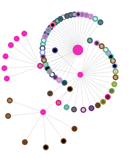
To make the colors more exciting, I tried associating each artwork classification with a unique color border, but this made the visualization incoherent, as shown below. There were too many colors at once.
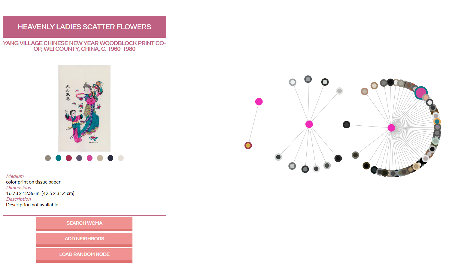
In the end, I re-processed the thumbnails to extract more than 3 colors, and then randomly chose 2 of the new colors to represent each node. While we still get a fair share of greys and beiges, this also picks out pieces with more vibrant colors, and strikes a good balance between the previous two examples.
To engage the audience, I added an introduction explaining what the network represented, as well as how the audience can interact the visualization. I also let the audience choose the initial nodes that are generated, which definitely makes the visualization feel more personal. This also makes the visualization less overwhelming, since users no longer are presented with 100 nodes at once; rather, they are given a small starting set and can expand from there.
A feature that I had originally included but later took out was the ability to sort and position the nodes based on color. I thought it would be a cool idea at first, but upon playing around with the feature, I realized that it doesn’t provide any more insights about the collection, and also detracts from the exploration aspect of the visualization. The sorting function itself was hard to figure out (color distance is a very interesting problem), and I couldn’t find a way to arrange the colors so that they didn’t all clump together.
This was really fun! It was my first time doing such a big information visualization project, and I learned a lot along the way. I’m definitely a lot better with D3 now compared to when I first started the project. There are still many aspects of the visualization that I would want to fine tune, and a lot more user testing could be done. Feedback was extremely helpful!